Seattle Soda Company
branding • packaging • illustration • web design • adobe dimension • adobe xd
creative direction and some illustrations by shawn davis
Oct 2018 - Dec 2020
The goal for this project was to create a new logo, branding assets, packaging for a new line of craft sodas, and a website.
Read on below 🙂
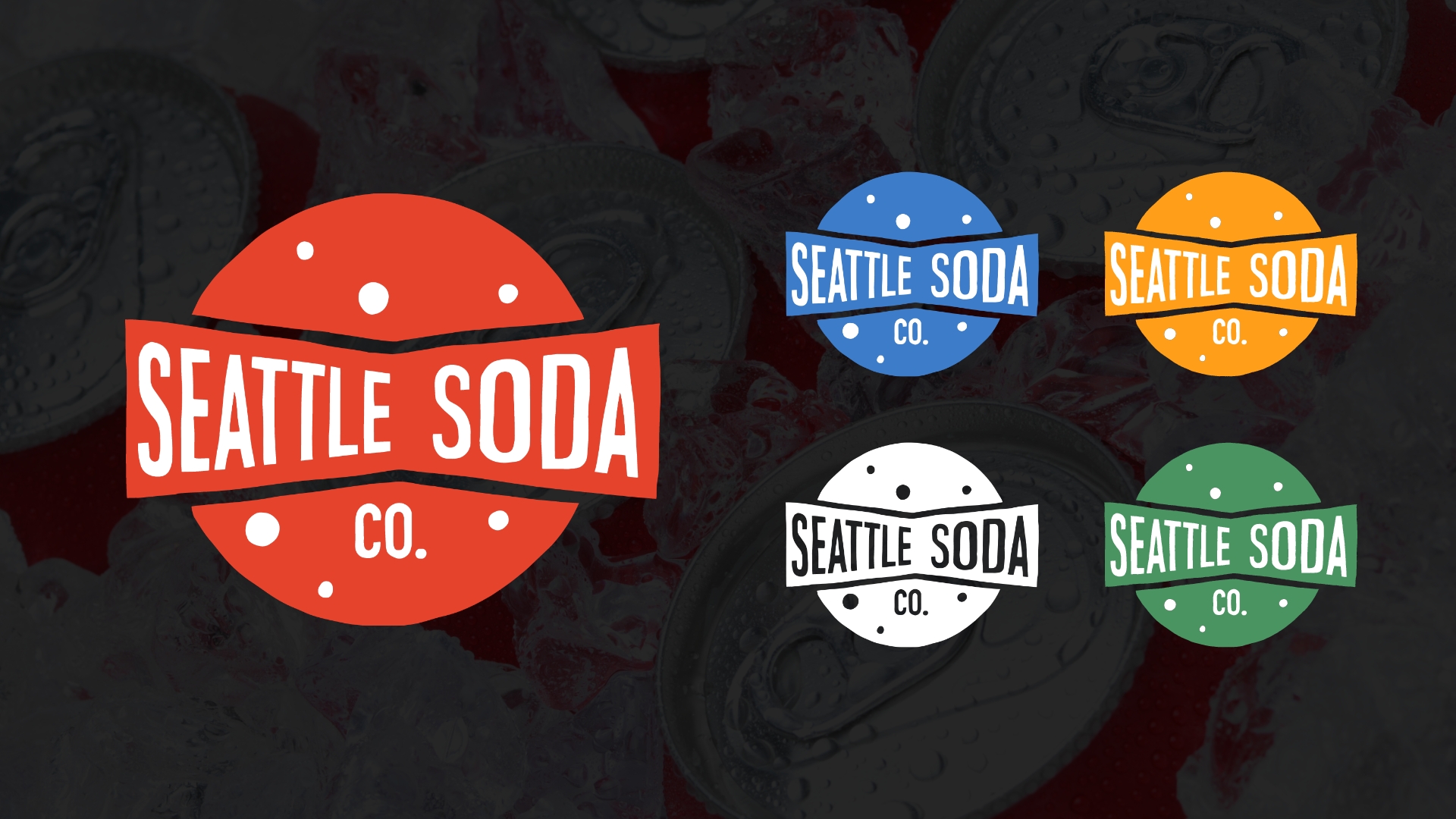
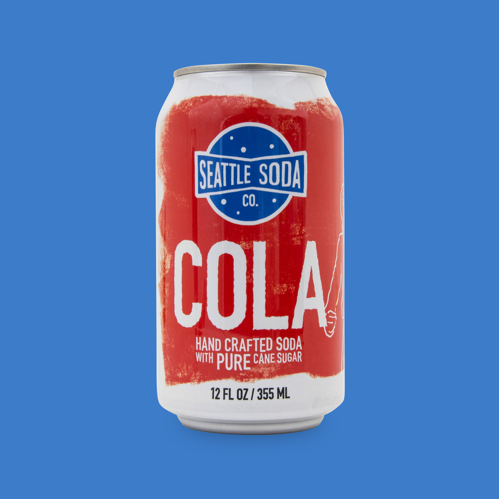
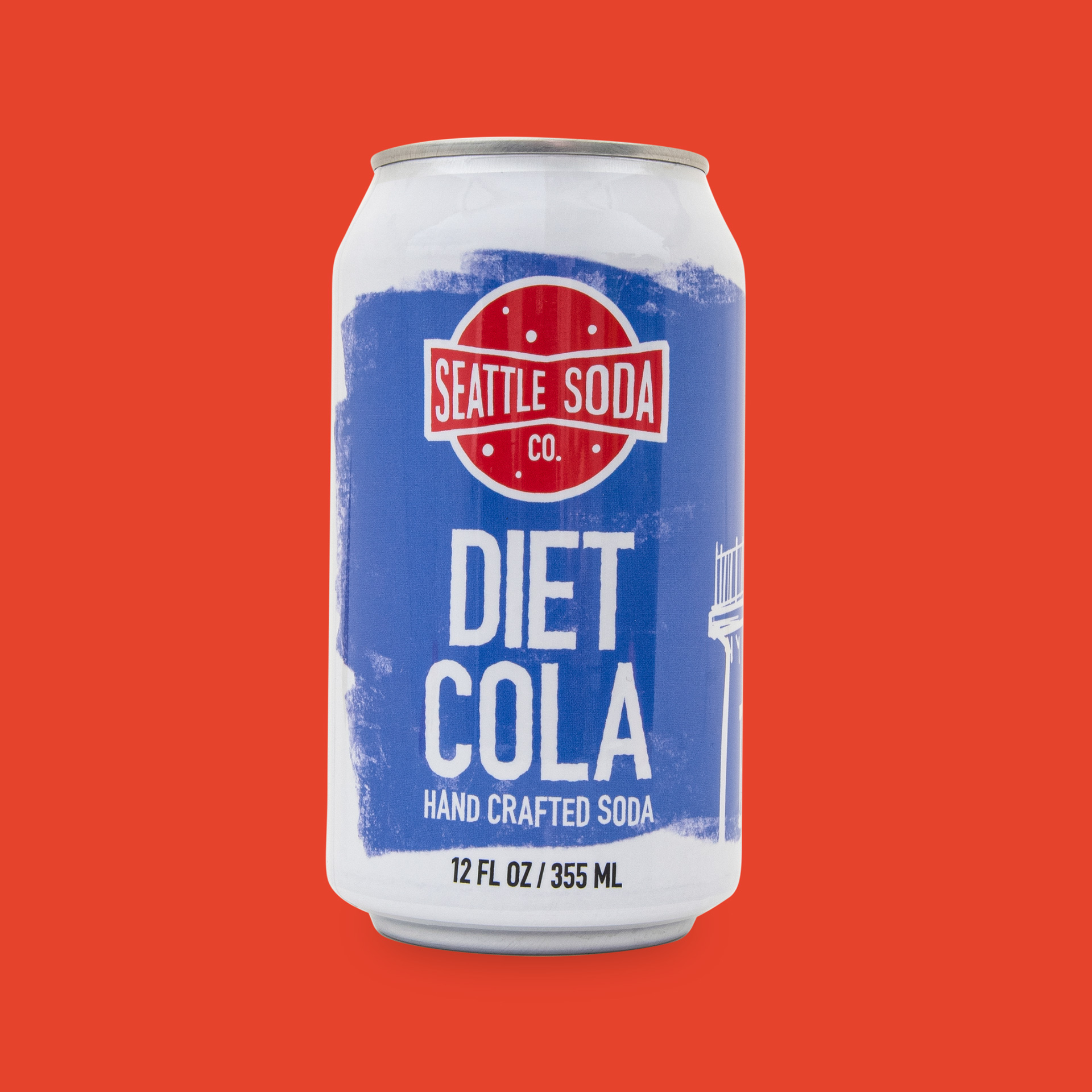
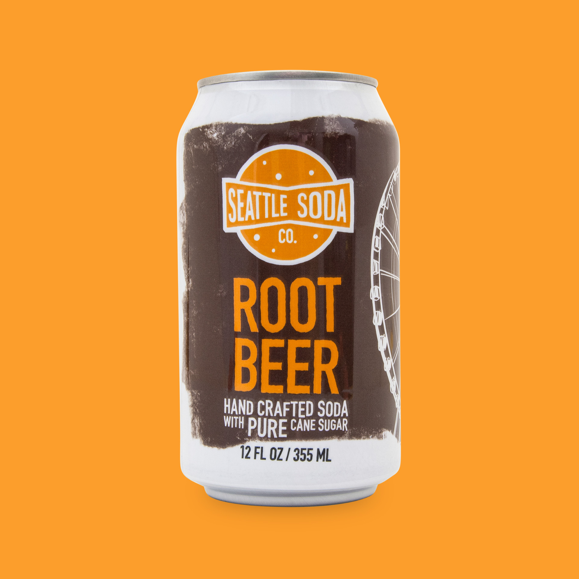
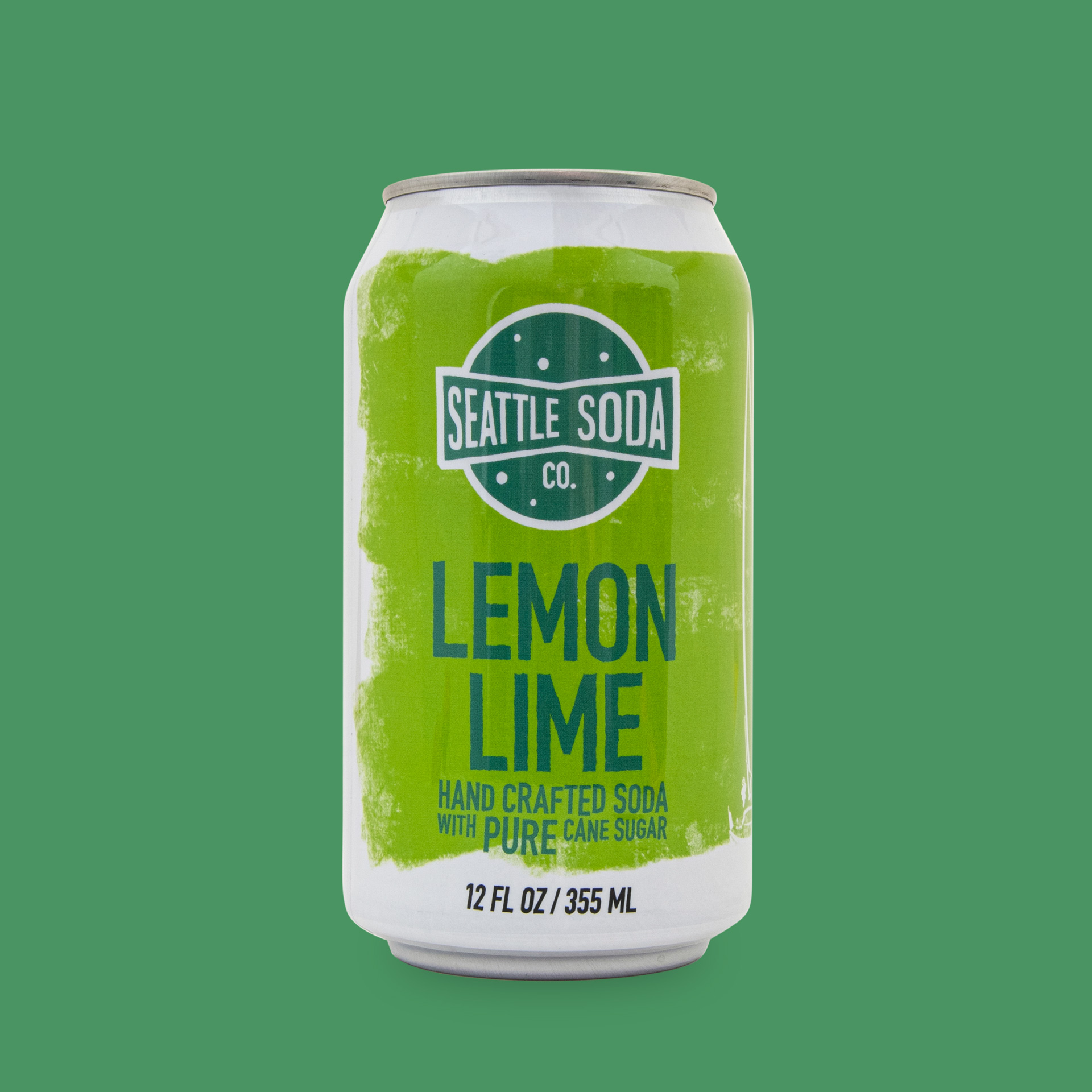
The goal for the new brand was to create a simple, yet recognizable symbol that could be used on the new website and all of the packaging.
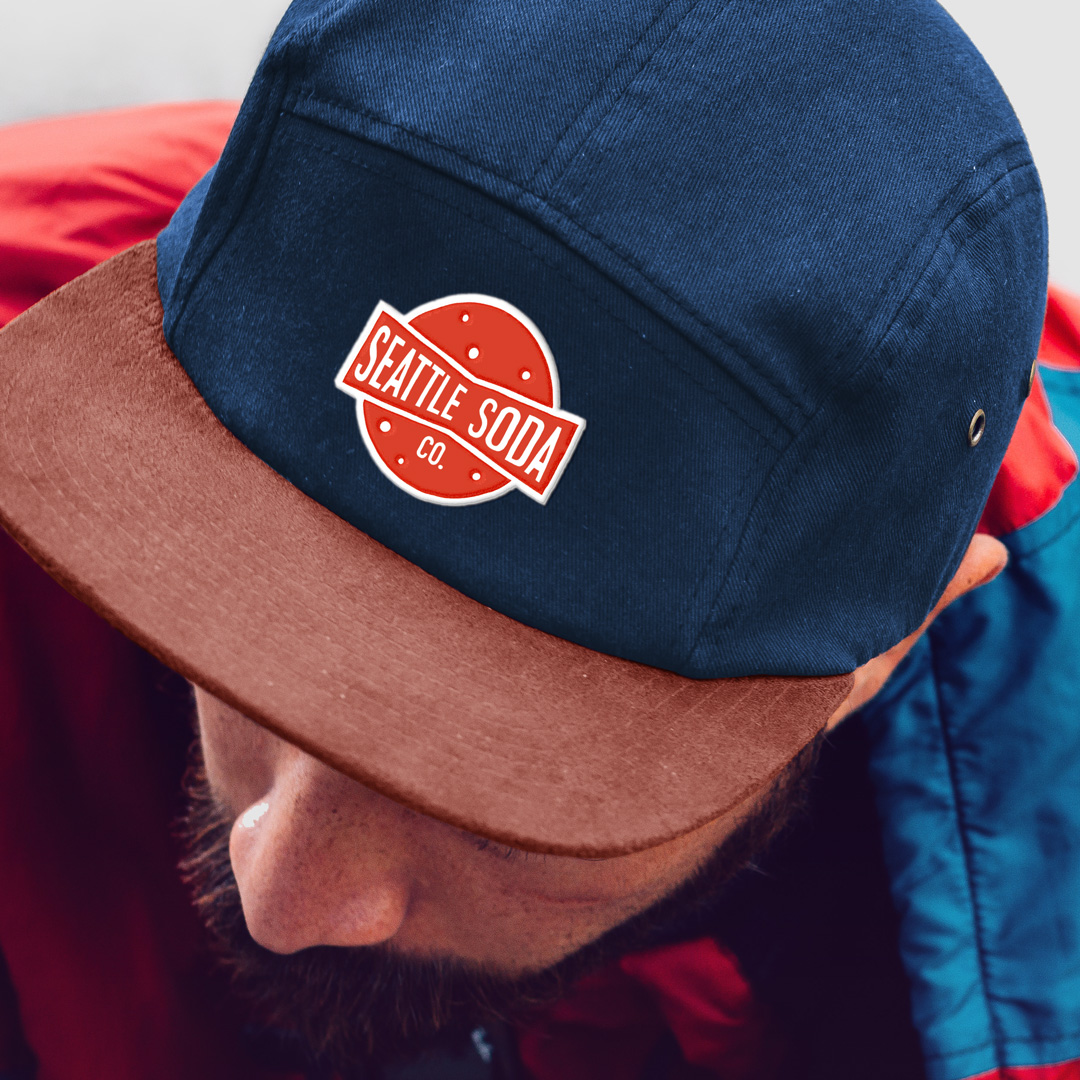
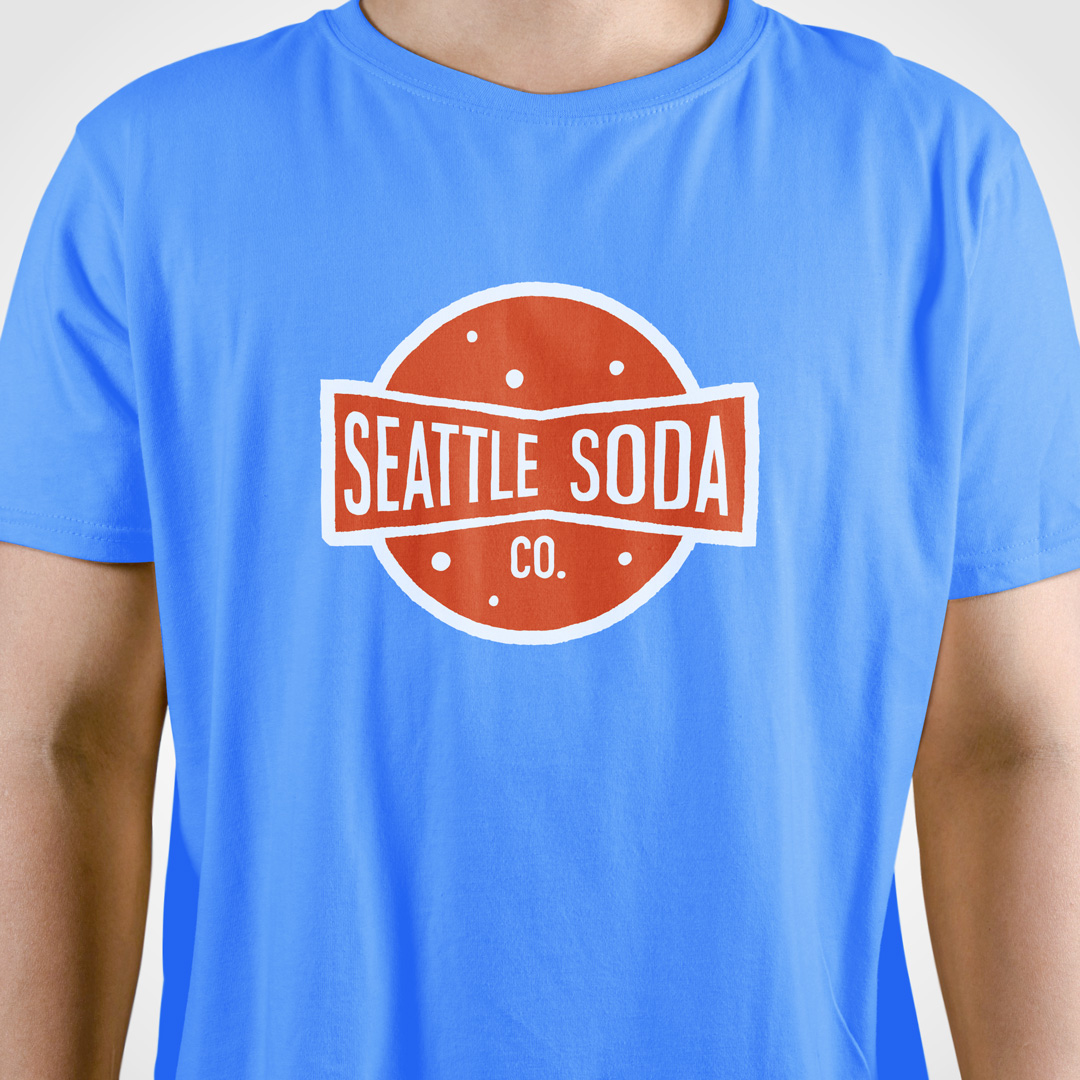
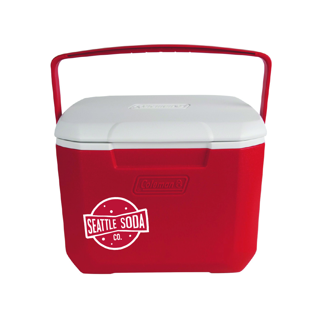
It needed to be able to translate into multiple colors easily as well. The logo I created features a clean, yet weathered mark placed over a circular can lid, with small bubbles to accentuate the fizzy nature of the drinks. The typography is based off DIN, but otherwise is completely custom and hand-lettered .
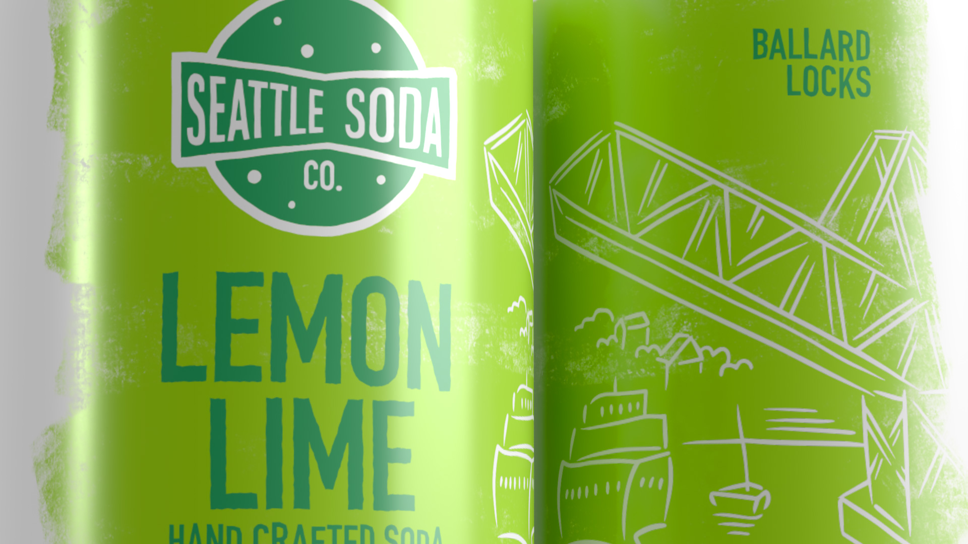
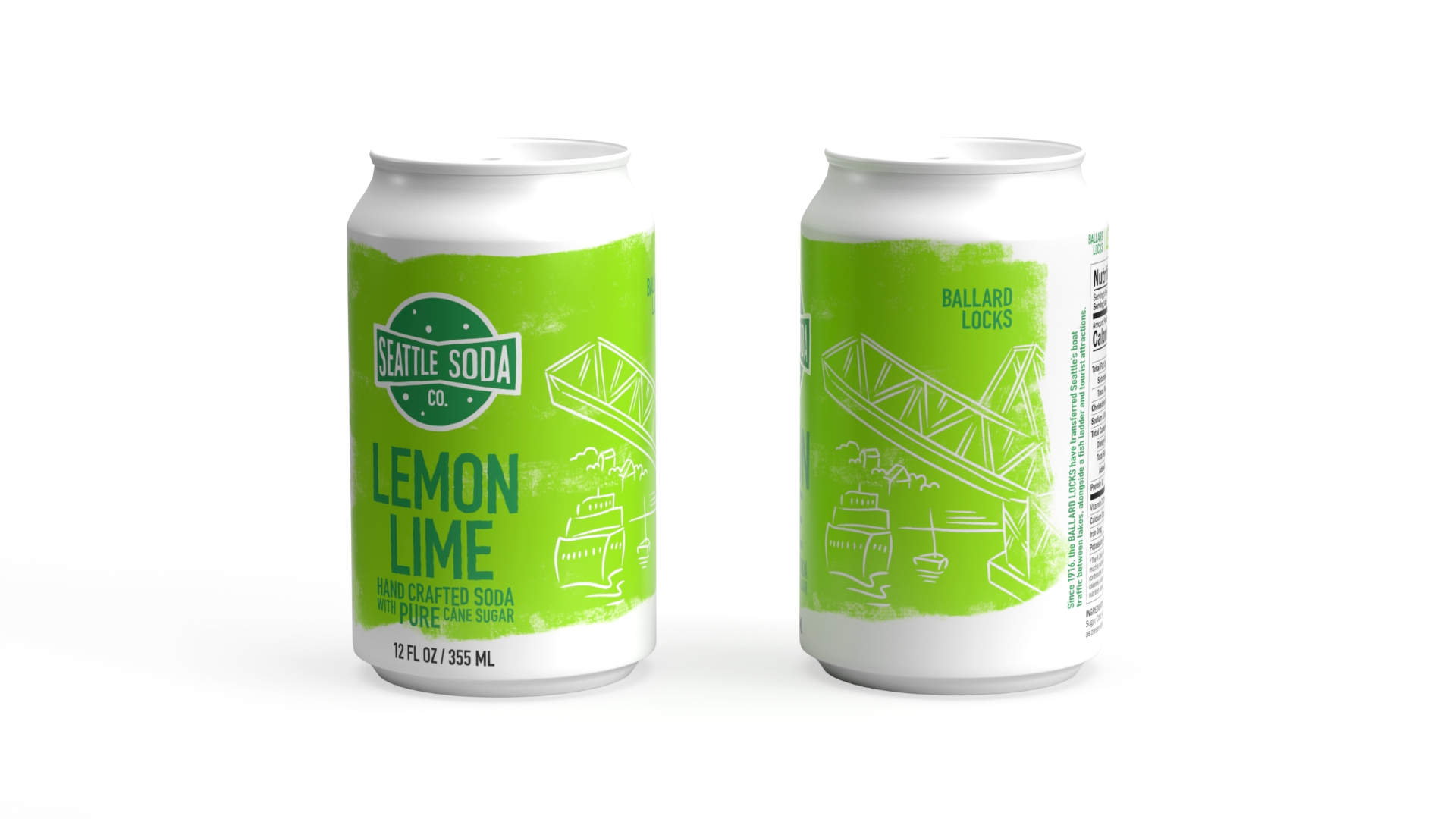
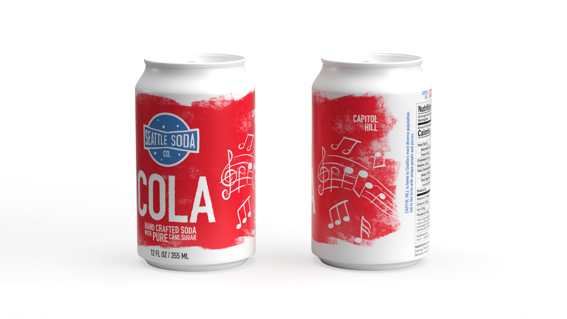
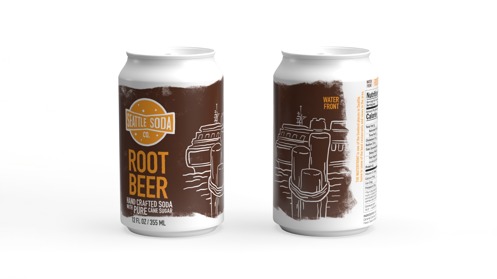
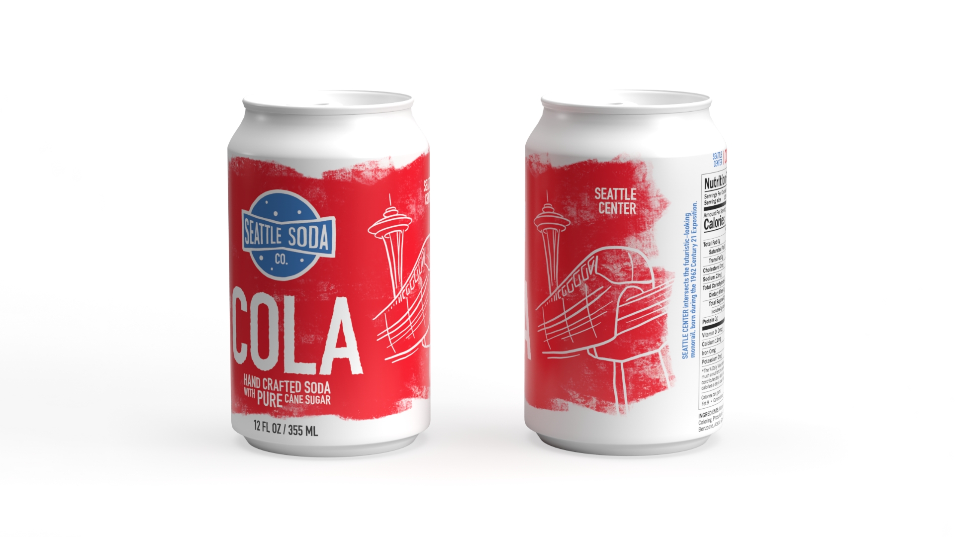
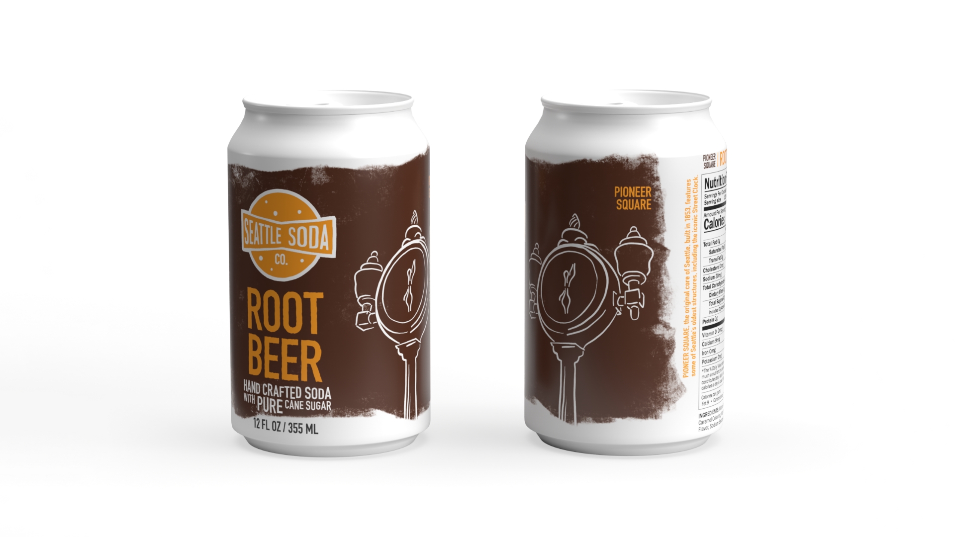
The goal for the new packaging was to create 4 labels for a new line of craft soda being manufactured directly by Seattle Soda. The can designs would feature a specific location in Seattle, each flavor with a different location.
These cans would need to be visually similar to other craft sodas, but also distinct .

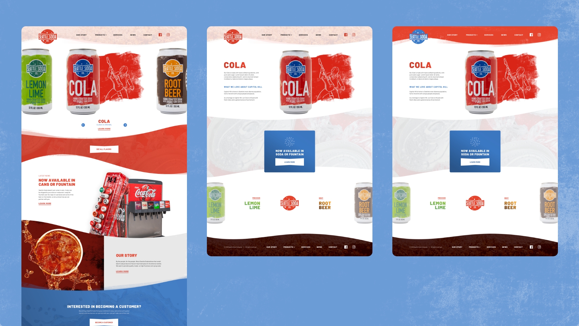
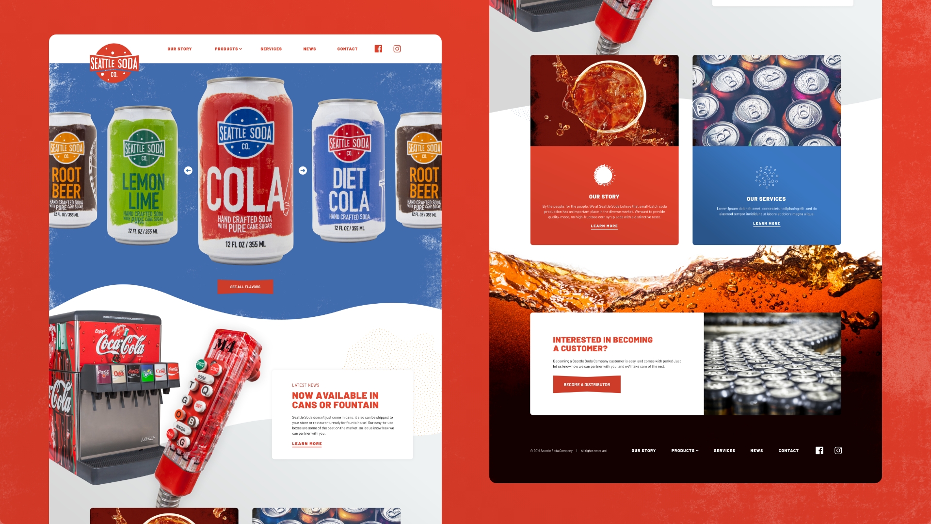
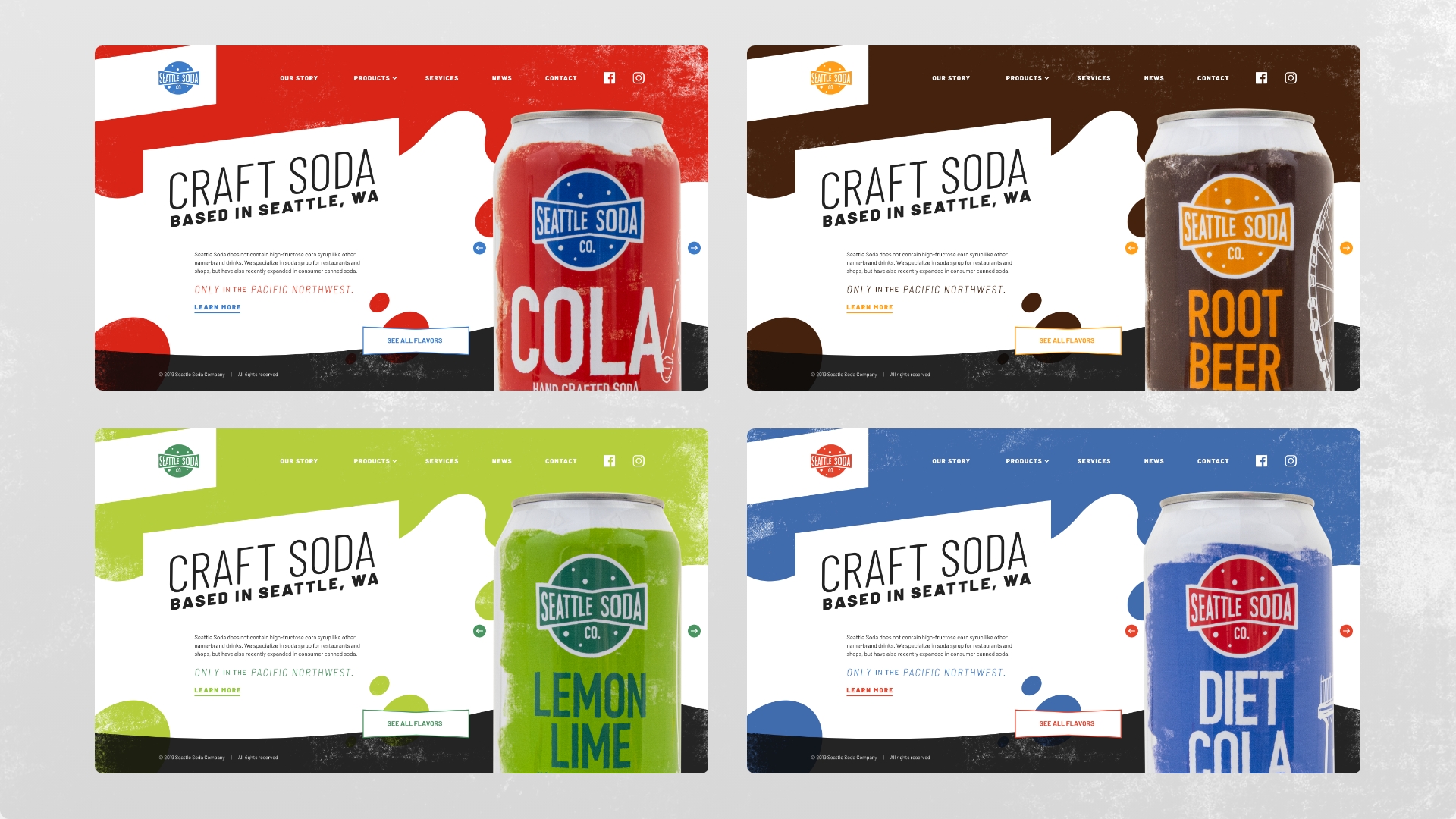
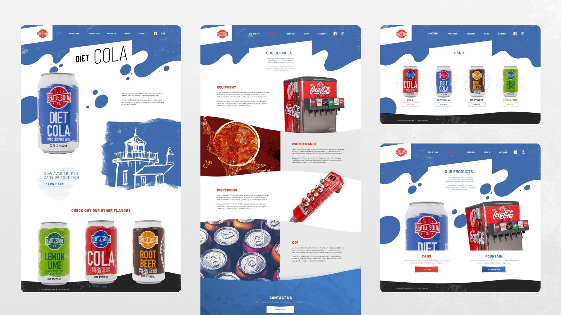
The goal for the new website was to create an engaging and striking website that would educate consumers about Seattle Soda Company and what they produce, as well as getting leads from distributors.
Unfortunately the client decided to drop the project, and so the website never got completed. However, I’m still proud of the work I came up with.
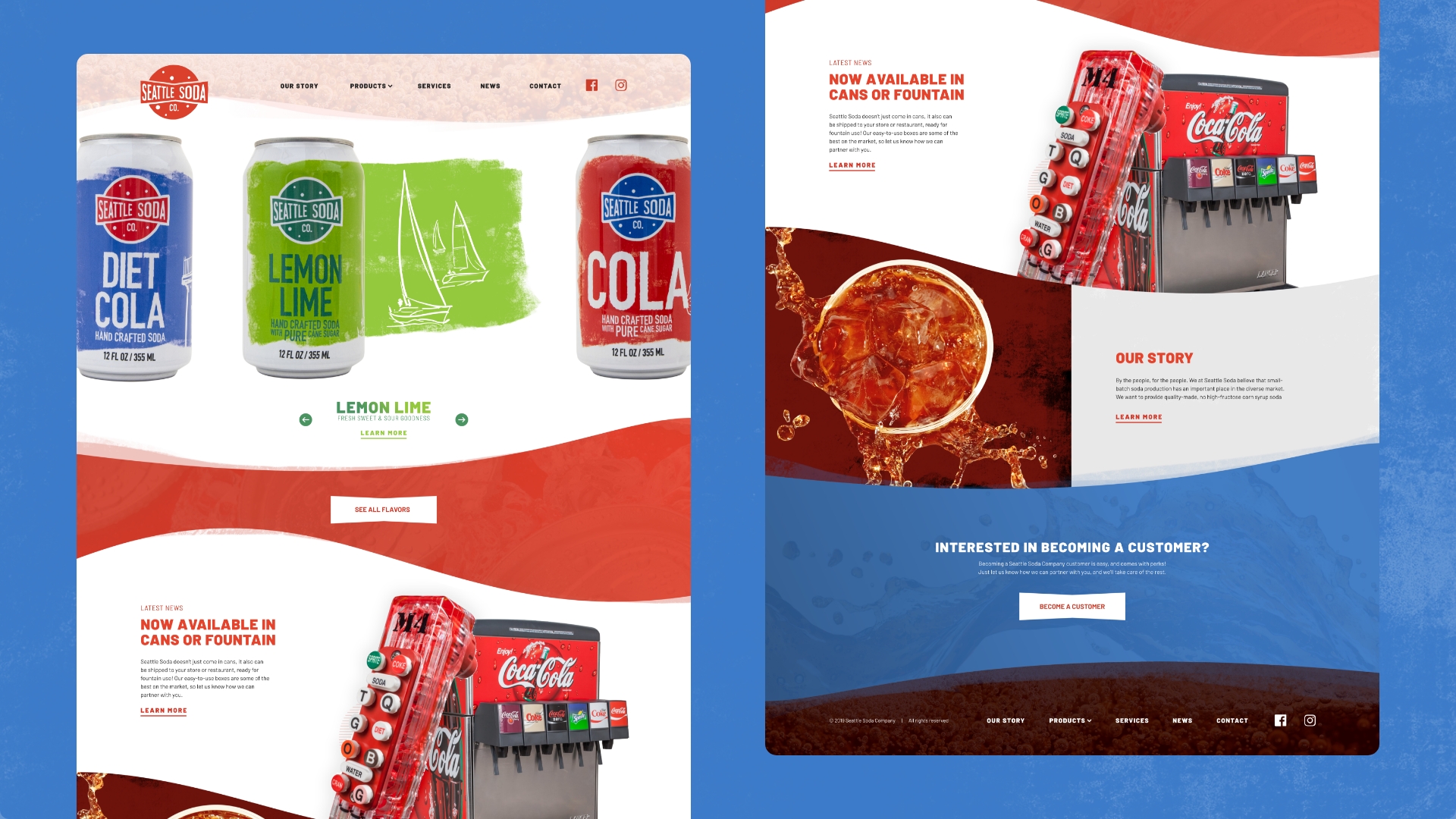
Version 1 showcases the can designs front and center, with flowing lines and grunge textures to mimic the can designs.
Version 2 also heavily uses the grunge texture from the cans, but also uses larger photos to create more impact.
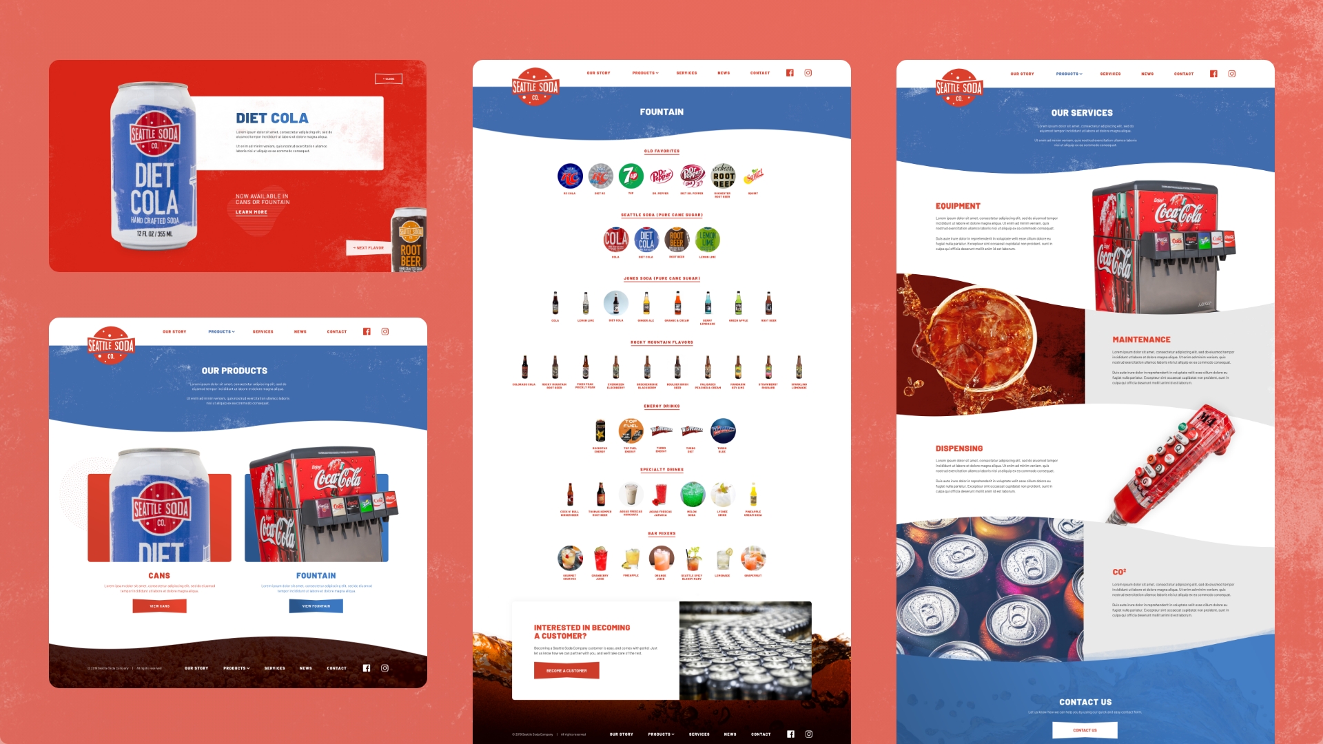
Version 3 is the most unique, as the homepage doesn’t scroll vertically, but features the most important information first, allowing the user to explore deeper.
similar projects
i love working with new people, so let’s chat!
"*" indicates required fields