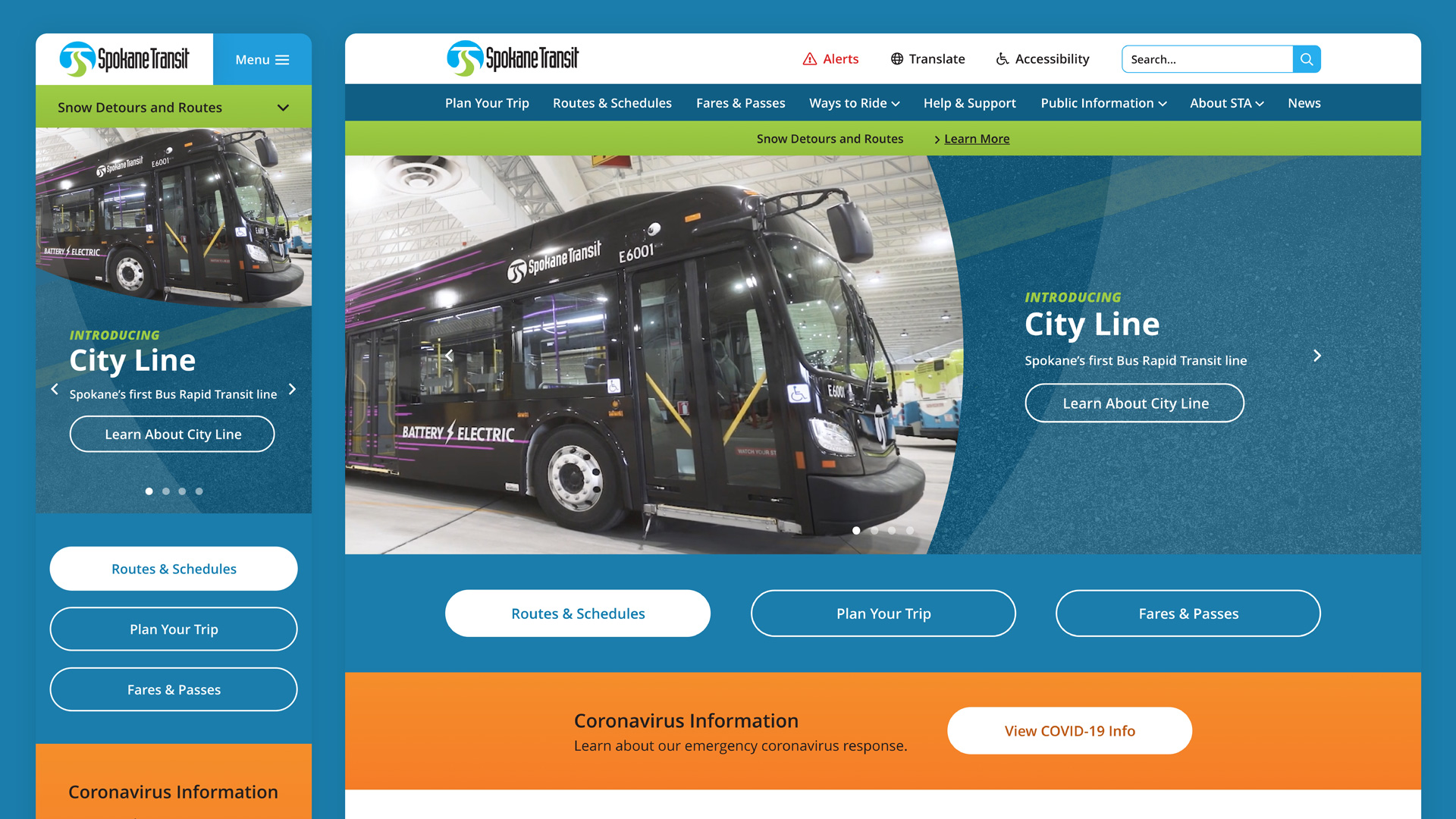
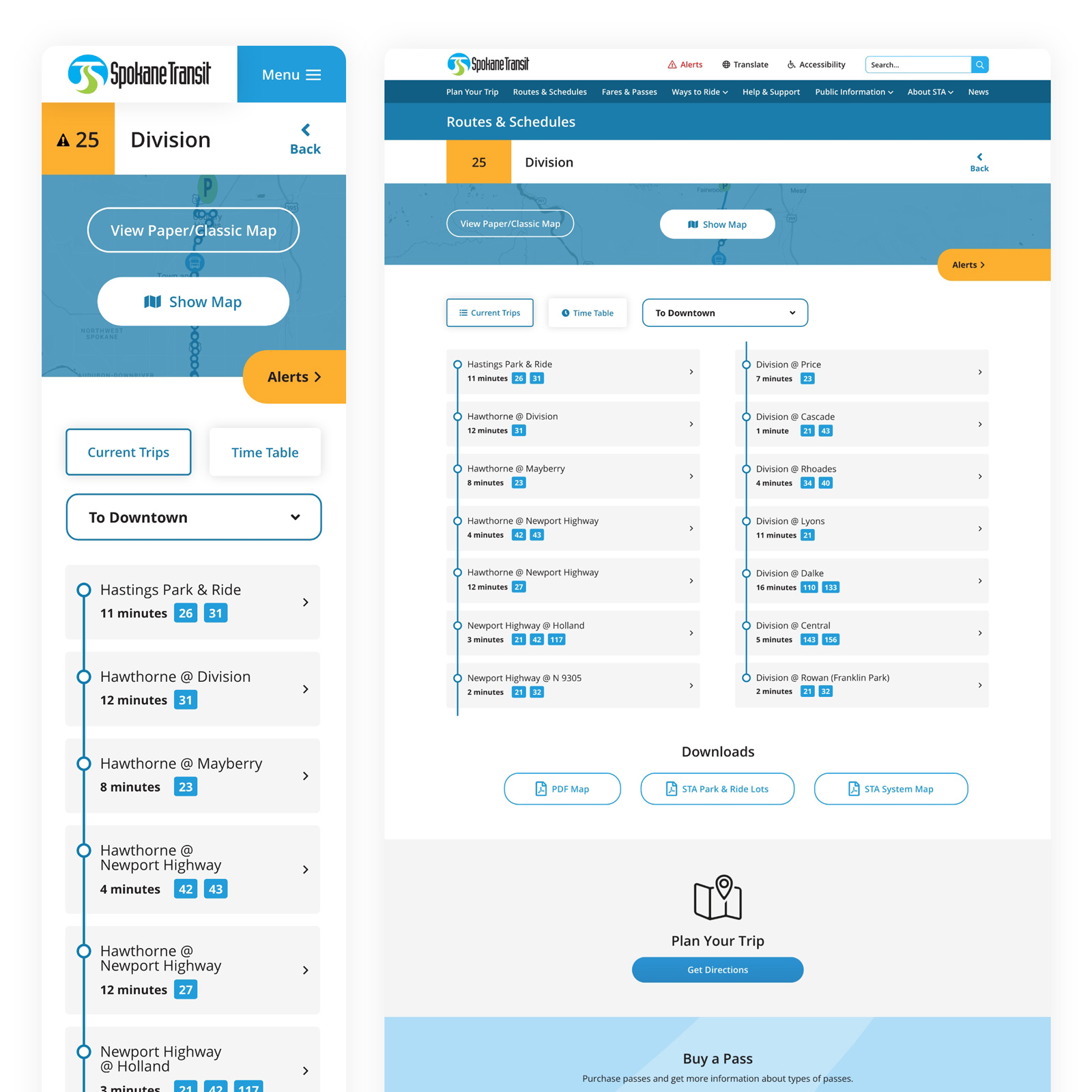
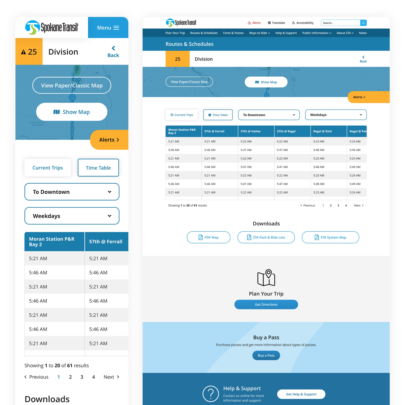
UX/UI • adobe xd • prototyping
creative direction by shawn davis | zipline b2b marketing
project background:
This was a tough project. The challenge was to update the website to be more polished and easy to use, easier to find routes and stops, be fully ADA accessible, and primarily focus on the mobile experience (since 90% of their website traffic comes from mobile devices).
research
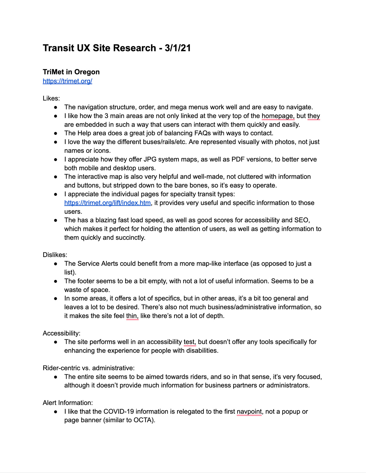
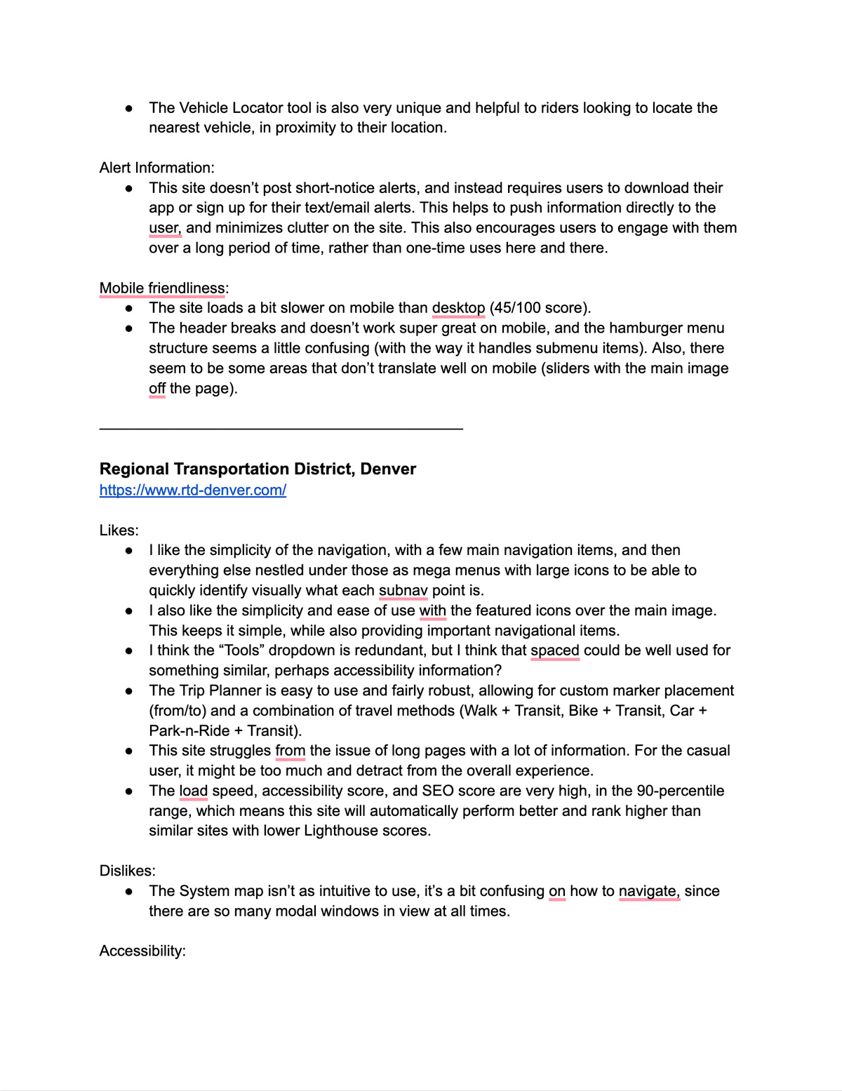
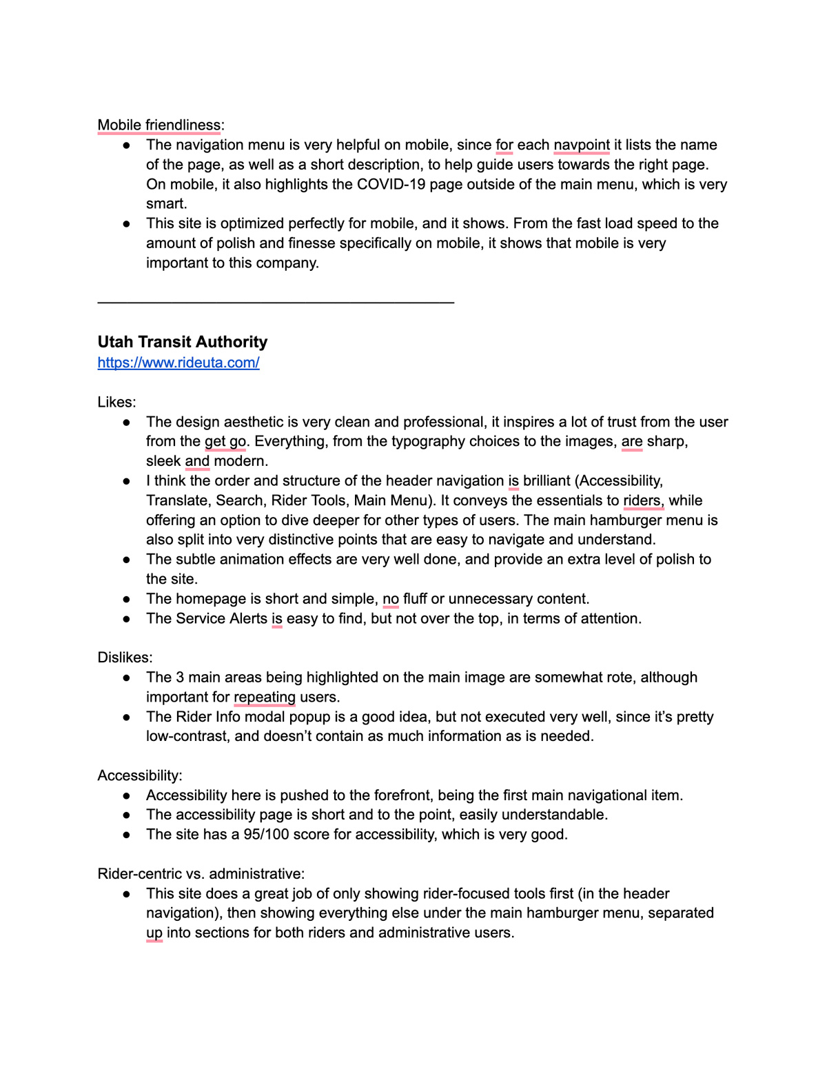
The project started with researching other transit sites for inspiration in both structure and functionality as well as design.
The main inspiration came from TriMet in Oregon, Utah Transit Authority, Regional Transportation District in Denver, LA Metro, Central Florida Regional Transportation Authority, Orange County Transportation Agency, London Transportation, Maryland Transit Administration, Regional Transportation Commission of Southern Nevada, Calgary Transit, and Community Transit of Snohomish County.
I audited each site for likes/dislikes, accessibility, whether they were rider-centric or administrative (since our goal was to cater mostly to riders), mobile-friendliness, and alert information.
sitemap
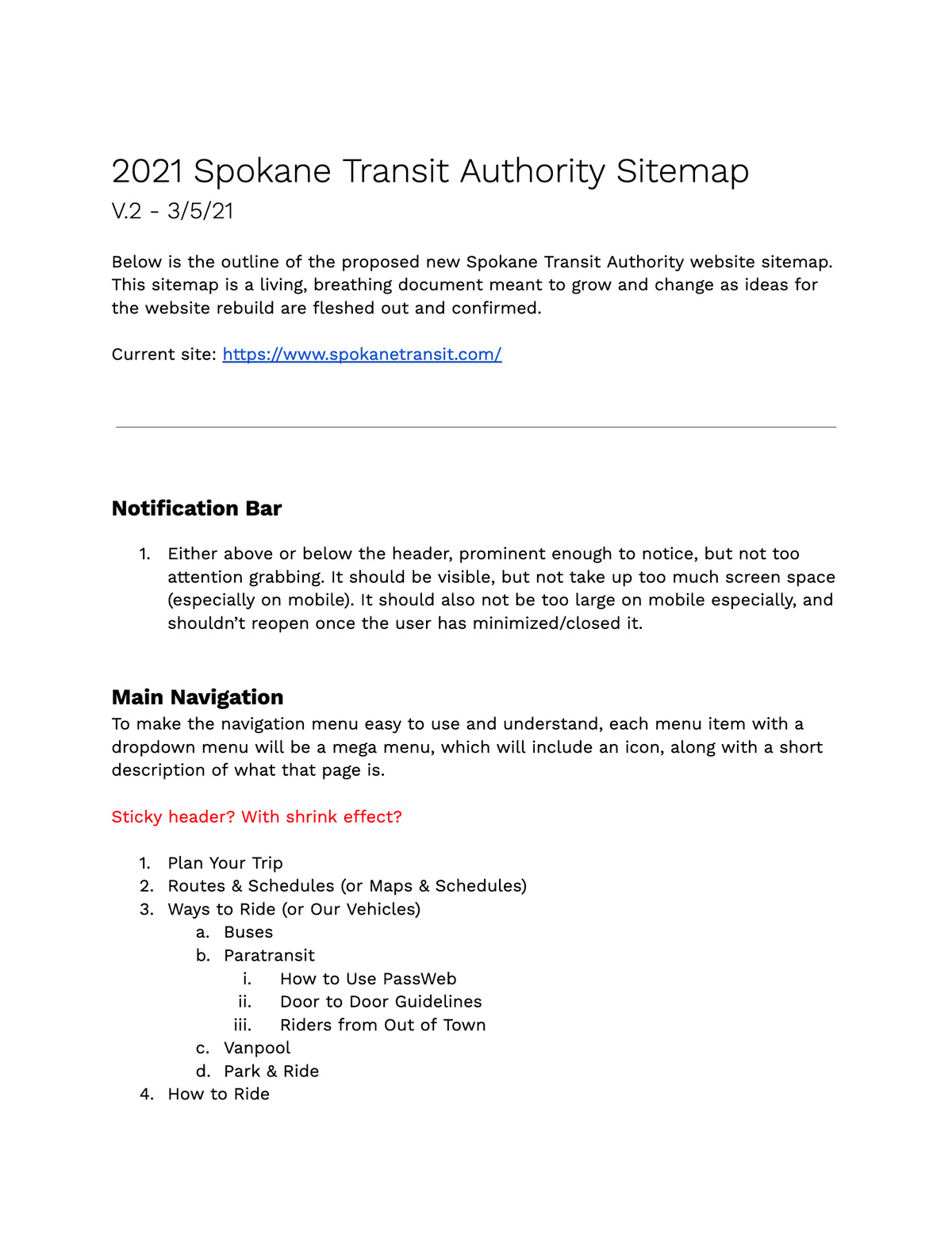
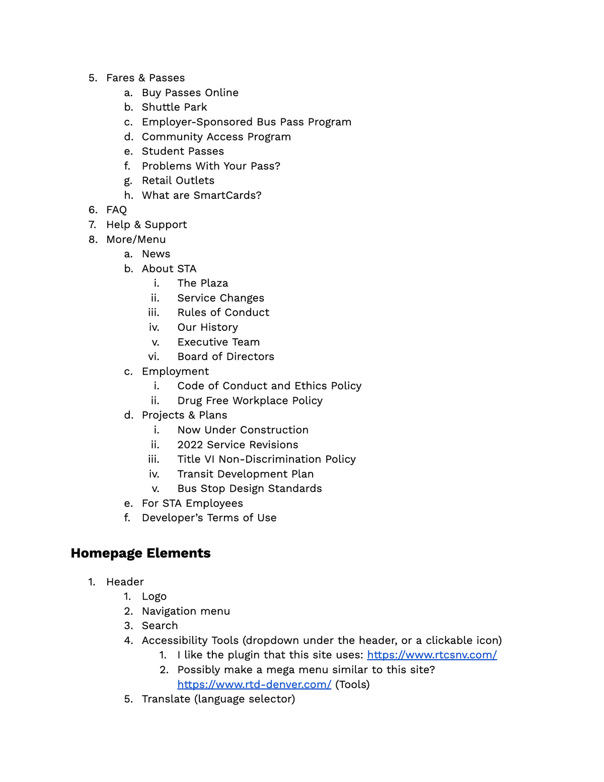
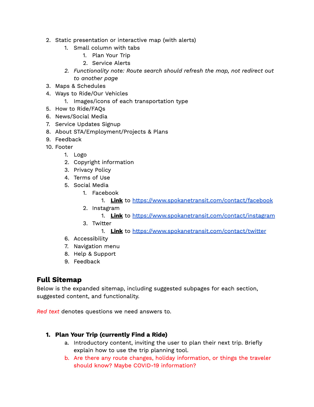
Next, I took into account the full existing sitemap (which had gotten unwieldy over the years, topping 200 pages on their site), and condensed and simplified that sitemap into something more manageable. We knew that commuters were the most predominant users, so I heavily focused on that experience over the others. The second version of my sitemap ran 81 pages long (covering 68 total website pages), which included content and functionality notes for every page on the new site.
sketches
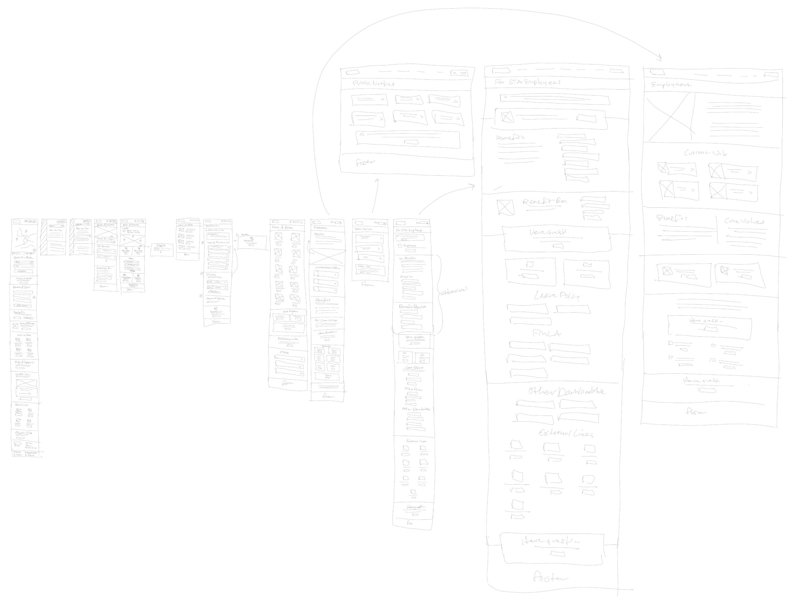
Once we had settled on the sitemap, I sketched out prototype mockups of the mobile homepage, menu, and route pages, as well as a few extra pages in the business section of their website for desktop users (since we knew from analytics that desktop users frequented the business-oriented pages).
design and mobile prototyping in adobe xd
